← Every exhibit
What the stop test reports when there is nothing to report
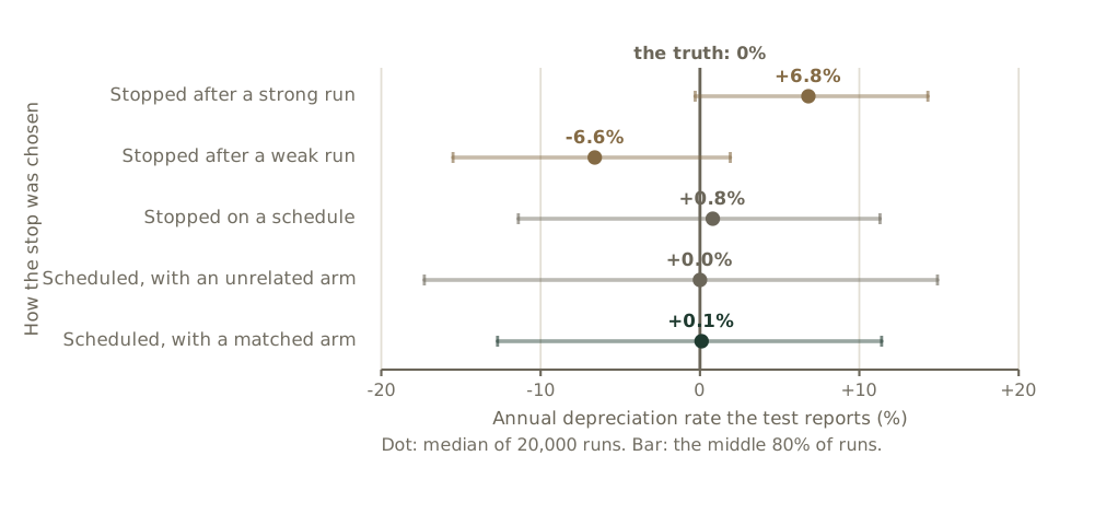
Nothing in the simulated data depreciates. The first two designs still report a rate, and its sign follows the reason the programme was stopped rather than anything about the asset.
Reference & Evidence
Source: Simulation, 20,000 runs per design. An AR(1) quarterly series, persistence 0.3, standard deviation 15% of level, with a true depreciation rate of exactly zero; twelve quarters before the stop and eight after. Script: instrument-test-decay.py, filed with the claim ledger.
Related exhibits
-
The same asset, left alone, at three published rates
From the essay Every growth budget is a gross number
-
How much of a change in spending has reached the asset
From the essay Every growth budget is a gross number
-
Every published depreciation rate, and what it was measured on
From the essay Every growth budget is a gross number